Setting Up the Seti UI Theme in Sublime Text
Seti UI is an amazing Sublime Text 3 theme ported from the Atom theme of the same name. It provides beautiful sidebar icons, like Material Theme, but with fewer stylistic gimmicks. It also sports beautiful blue/yellow highlighted text in the Command Palette, the Completion Popup, and the Goto Window. You can install it with Package Control.
Issues
There were a few things that bothered me about Seti UI out of the box:
- You can’t see many files and folders in the sidebar, because there’s too much padding between rows.
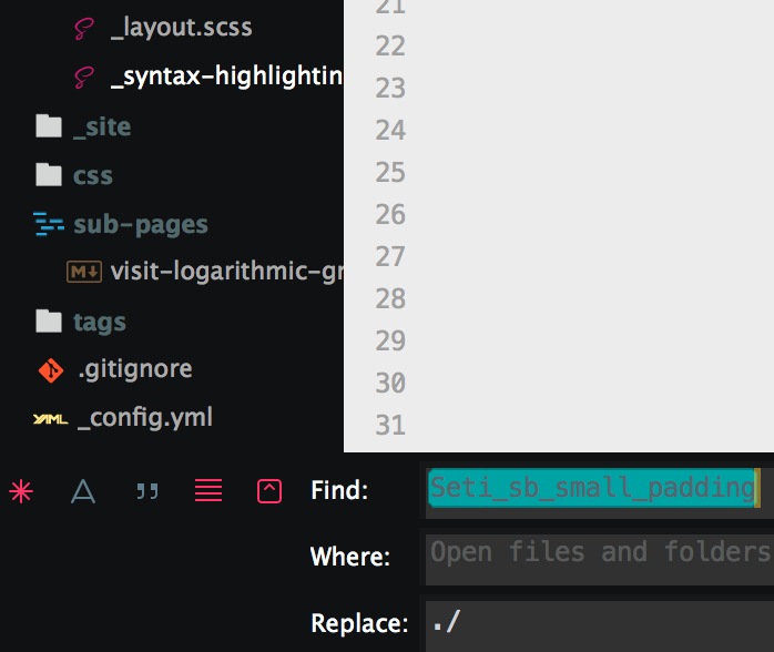
- The text inputs in the Bottom Panel and the Command Palette have a black background. The panels surrounding the text inputs are also black.
- It’s not obvious that these are text inputs.
- If the text in them is selected, it’s very difficult to read.
Fortunately the theme is easy enough to customize. I’ll explain how I made my changes, in case you’d like to make some of them yourself, and you don’t know where to start.
Tweaks
To get more stuff into your sidebar, you can simply insert "Seti_sb_small_padding": true into your Preferences.sublime-settings. This will greatly reduce the padding between rows. For me however, it made things a little too cluttered. If you want complete control over this padding, all you have to do is open Packages/Seti_UI/Seti.sublime-theme, look for Seti_sb_small_padding and change the value of row_padding from [8,3] to [8,4] or [8,5], or whatever you prefer.
{
    "class": "sidebar_tree",
    "settings": ["Seti_sb_small_padding"],
    "row_padding": [8,5]
},
Modifying the text inputs is trickier, because their styles aren’t defined in Packages/Seti_UI/Seti.sublime-theme, but rather in Packages/Seti_UI/Main/Widget - Seti.stTheme, which is XML instead of JSON. Here are the fields you need to modify.
    <key>background</key>
    <string>#313131</string>

    ...

    <key>selection</key>
    <string>#00ffff</string>
The best way to do this is to create the Seti_UI directory in Packages/User, and copy the two config files into this directory. This will make sure the base config is read from Packages/Seti_UI, while your custom config is read from Packages/User/Seti_UI. The only other thing you need to do is edit Packages/Seti_UI/Widgets/Widget - Seti.sublime-settings, so that the color_scheme property points to your custom widget.
{
    "color_scheme": "Packages/User/Seti_UI/Main/Widget - Seti.stTheme",
    "draw_shadows": false
}
If you do this, your custom config won’t get clobbered every time Package Control installs an update for Seti UI!
This is what it looks like on my machine: the sidebar chock full of folders and files, and clearly demarcated text inputs with clearly visible text, even when it’s selected. Word.
